Guide
Theming
Druxt components can be themed using two primary methods:
DruxtWrapper
Druxt modules use a DruxtWrapper component system to render a Vue component with the available data, slots, props and $attrs to be used for theming.
The specific component rendered is determined by list of available component options, made from properties and data provided by the module, and using the first registered option.
e.g., A DruxtEntity component might render a DruxtEntityNodeArticleDefault.vue wrapper component.
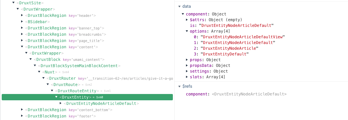
Component options can be seen via the component.options data of the relevant Druxt module component.
If there are no matching component names, a default DruxtWrapper component will be used to render the default output of the module.
- For more details, see the DruxtModule API documentation.
<Druxt
  module="entity"
  :props-data="{ type: 'node--article', uuid }"
/>
<!-- ~/components/druxt/entity/node/article/Default.vue -->
<template>
  <div>
    <h1>{{ $attrs.entity.attributes.title }}</h1>

    <slot />
  </div>
</template>
Default template
Most Druxt modules can have the default template overridden, allowing for full control of the default slot rendering.
The available data provided to the template scope is determined by the relevant module.
<DruxtEntity v-bind="props">
  <template #default="{ entity }">
    <div>
      <h1>{{ entity.attributes.title }}</h1>
    </div>
  </template>
</DruxtEntity>
By default, a component using the default template will not be wrapped by a DruxtWrapper component. It is possible to enable the DruxtWrapper system by setting the wrapper property to true:
<DruxtBlock v-bind="props" :wrapper="true">
  <template #default="{ block }">
    // This will be wrapped by a DruxtBlock Wrapper component.
  </template>
</DruxtBlock>